
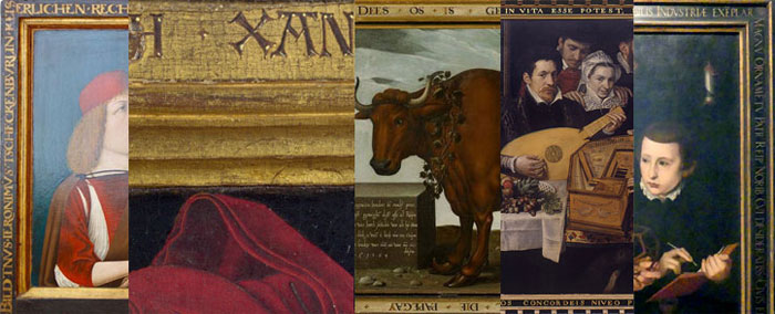
“Gesamtkunstwerk”
from text and image
From ancient architecture we are familiar with inscriptions on buildings and monuments, tombstones or statues. These ” labels ” had the function to consecrate, to honor, to commemorate or to describe. In this way, the inscribed objects were testified to value, dignity, grandeur, esteem and respect. The material and technique used played a key role in the aesthetic effect – chiseled in stone, engraved in metal, carved on masonry or wood, scratched or painted.

St. John the Baptist, around 1330, stone tablet from the former Johanniterhof in Augustiner street in Wurzburg
On loan from the ”Freunde Mainfränkischer Kunst und Geschichte e.V.” in the Museum für Franken in Wurzburg, Photo Archive
The inscription commemorates the foundation of the building by Heinrich von Grünsfeld in 1330.
Picture frames as inscription carriers seem to be a natural development of architectural inscriptions, closely connected with the development of altars in the Middle Ages. Elaborately carved altars constructed with multi-part wings (polyptychs; usually triptychs) stood on walls or free-standing in the church interior. The frames were part of the overall construction and had the task not only to stabilize and protect the picture panels, but also to open or close them, depending on the feast day.
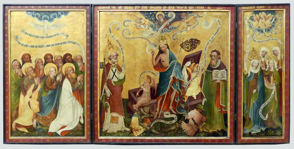
Resurrection altar from Arnstadt, around 1430, unknown artist,
Gemäldegalerie, Foto: Kunstbeziehungen
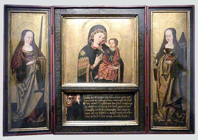
Triptych with a copy of the Madonna of Grace from S. Maria del Popolo in Rome, Augsburg around 1490 – 1495, unknown artist
Germanisches Nationalmuseum, Nürnberg, Foto: Kunstbeziehungen
In the Middle Ages, the church was usually also the client for paintings. Inscriptions on frames therefore described the Christian motifs. Writing was still a privilege of the church at that time. Almost every monastery had a writing room, the scriptorium, where monks mastered the art of writing and illustrating. In the illuminated handwritings of manuscripts and books we also find the direct connection between text and image. An adaptation of this connection to the frames seems natural. In terms of content, the inscriptions were of a purely religious nature, whether they were altarpieces or reliefs, biblical stories, legends of saints, honoring benefactors, or allegories of Christian virtues.
The polychrome painted or gilded wooden frames were either made of plain moldings with straight and linear profiles or consisted of frame moldings with carved Gothic ornaments similar to those used in architecture. Often the panel and frame were carved and painted from the same wood. The color scheme of the frames mirrored that of the paintings.
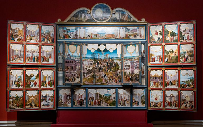
Gotha table altar, arroun 1538, Heinrich Füllmauer
Herzogliches Museum Gotha, Wikimedia, Foto: Werner Murrer
The inscriptions were mostly on the plinth between the main body and the predella or also around the panel. They were either etched, applied using the pastiglia technique or painted polychrome. The predominant typeface in the late Middle Ages was the Uncial in various forms typical of the country; writing was mostly in Latin.
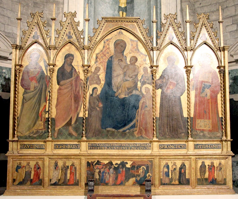
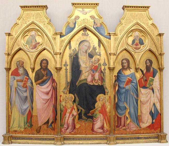
Triptych, 1388, Agnolo Gaddi
Gemäldegalerie, Berlin, Foto: Kunstbeziehungen
A distinctive frame feature from the Middle Ages is the „sill”. A relic from architecture, where the lower side of the frame was flattened, as like a window sill – a reference to the view into the divine sky is obvious. The sill is often found on altar frames or portraits of saints until the Renaissance and formed an ideal surface for inscriptions below the image.
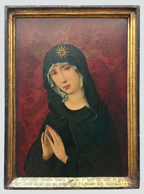
Mary as Mother of Sorrows, 1495, Hans Holbein the Older
Gemäldegalerie, Berlin, Foto: Kunstbeziehungen
Inscription: Ego mater pulchræ dilectionis, et timoris, et agnitionis, et sanctæ spei. In me gratia omnis viæ et veritatis : in me omnis spes vitæ et virtutis. Transite ad me, omnes qui concupiscitis me, et a generationibus meis implemini. (Jesus Sirach, Kap. 24, Vers 24-26:)
Translation: Ich bin die Mutter der schönen Liebe und der Angst, und des Wissens und der heiligen Hoffnung. In mir ist alle Gnade des Weges und der Wahrheit; In mir ist alle Hoffnung auf Leben und Tugend. Kommt zu mir, alle, die ihr mich begehrt, und ihr werdet von meinen Schöpfungen erfüllt.
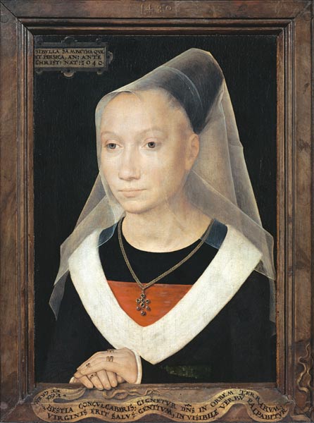
Portrait of a young Woman (Sibylla Sambetha), 1480, Hans Memling
St. John’s Hospital, Brügge, Wikimedia
Inscription below in Trompe-l’œil style: ECCE BESTIA CONCVLCABERIS, GIGNETVR D[OMI]N[U]S IN ORBEM TERRARVM ET GREMIUM VIRGINIS ERIT SALVS GENTIVM, INVISIBILE VERBV PALPABITVR
Translation: Siehe, du [Un-]Tier wirst zertreten werden [und] der Herr wird geboren werden auf den Erdkreis und der Schoß der Jungfrau wird das Heil der Völker sein; das unsichtbare Wort wird greifbar werden
The Renaissance was a time of upheaval, the transition from the Middle Ages to the modern era. It was characterized by an attempt to revive Greek and Roman antiquity and the flourishing of the sciences. Starting in the cities of northern Italy, it also influenced art, culture and science north of the Alps.
An early type of frame from the Renaissance is the tabernacle or aedicular frame from Italy. Its architectural relation to the window or temple is obvious. Richly carved with column structure imitated from antiquity, architrave and gable roof. Very often it framed the motif of Mary with Child and was inscribed, among others, “Ave Maria Gratia”. These inscriptions are reminiscent of inscriptions from monumental architecture, in the font Kapitalis Monumentalis. The letters, written purely in capital letters, were either in the architrave above the image or on the pedestal below. Most of the inscriptions were set in the sgraffito technique in gold and polychrome.
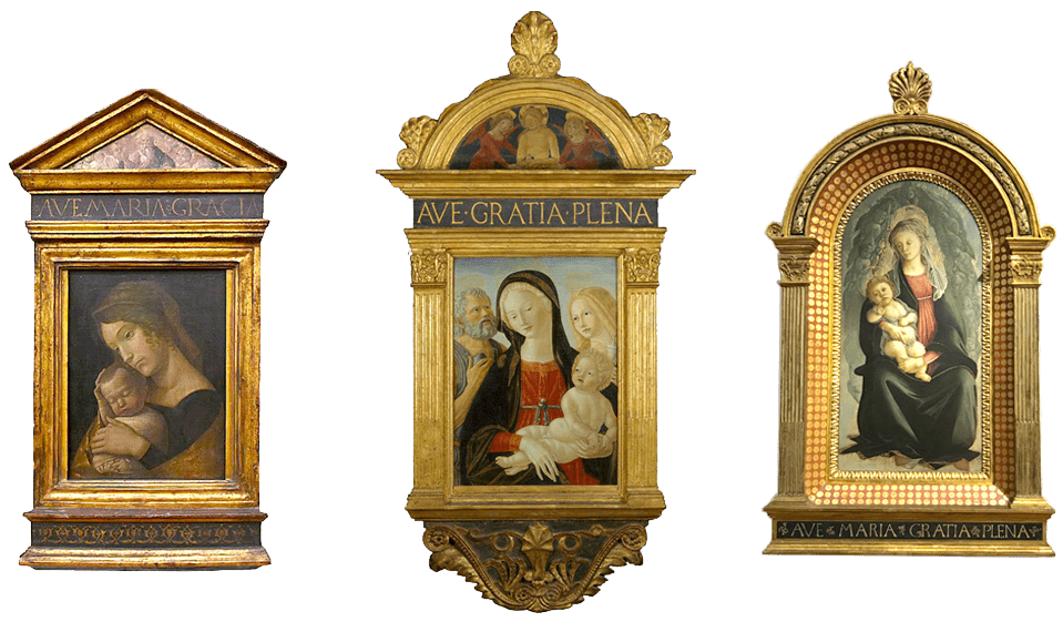
Left: Mary with the sleeping child, around 1465 – 1470, Andrea Mantegna, frame not original, Bode-Museum, Berlin, Wikimedia
Middle: Mary and child with Saint Jerome und Maria Magdalena, around 1490, Neroccio de‘ Landi, MET Museum New York
Right: Mary with child, 1466-1467, Sandro Botticelli, Uffizien, Florence
If the picture frame initially had a purely supporting function, in the 15th century the construction and decoration of the frame received more and more attention. The exploration of perspective, proportion, man and nature was reflected in both the paintings and the frame. In particular, humanism brought new pictorial content and techniques. From the guilds of carpenters, joiners, sculptors, turners, and gilders, more and more workshops emerged that specialized in the craft of framing. The collaboration of frame makers and painters in the artists’ workshops of the Renaissance is obvious. Pictures and frames still belonged together.
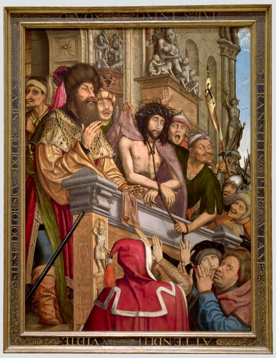
Crist presented to the people, 1518 -1520, Quentin Massys
Prado Museum, Madrid, Foto: Museo Nacional del Prado
Inscription: O VOS OMNES qVI / TRANSITIS PER VIAM/ ATTENDITE & VIDETE/ SIEST DOLOR SICVT DOLOR MEVS (Altes Testament, Klagelieder, Kap.1, Vers 12.)
Translation in german: O ihr alle, die ihr auf dem Weg vorbeigeht, gebt acht und schaut, ob es einen Schmerz gibt, der wie mein Schmerz ist!
The Italian and Spanish inscribed cassette frames clearly show the new influences of the time. In order to direct the perspective even more towards the picture, frame profiles were constructed descending from the outside to the inside. They lined flat surfaces that provided suitable space for fine ornaments and inscriptions around the picture. These surfaces were gilded, silvered or polychrome painted. Provided with rich ornaments and inscriptions in the sgraffito technique, they were also often additionally punched or painted. Inscriptions were very decorative, colorful and textually extensive. In terms of content, they consisted of psalm texts, which typographically were still predominantly in the tradition of the Capitalis, but already showed clear stylistic elements of the finely drawn letters of the Venetian Renaissance Antiqua. They derive their character from the serifs and the “bold-fine contrast” in the line work. Typical of the period is the mixture of features from monumental and handwriting. Ligatures, for example, have a long tradition in handwritten texts. Particularly appropriate here to make full use of the available space on the frame moldings.
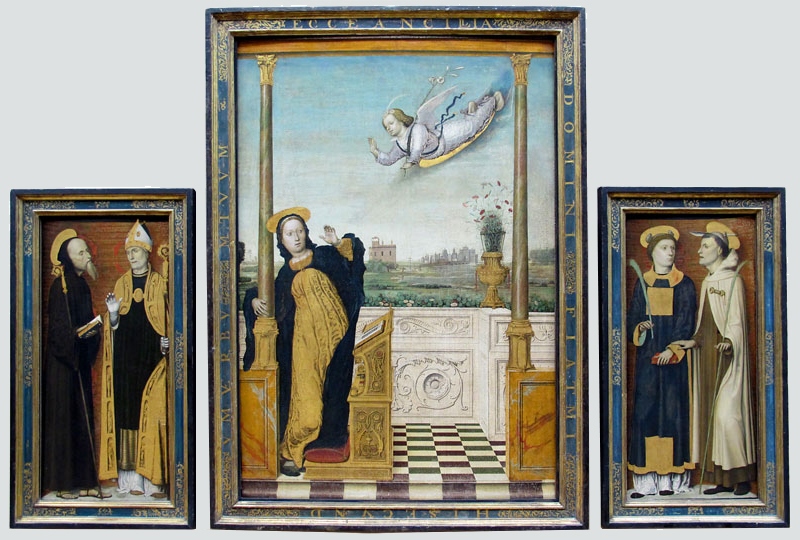
In the transition from medieval handwritings to movable metal type, many forerunners of today’s antiqua typefaces (incunabula) were created. Venice was a center of the first printers (Officin) in the mid-15th century. Scholars, publishers and printers from all over Europe met here to print texts and constantly develop new typefaces. Conrad Sweynheym, Arnold Pannartz, Nicolas Jenson and the Speyer brothers were some important type designers and involved in the development of the first convincing Antiqua, the Renaissance Antiqua. The Italian humanist, publisher, and typographer Aldus Manutius refined it into the most commonly used type.
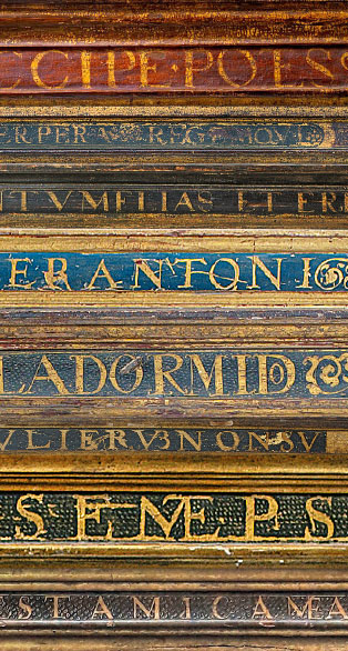
Various frame inscriptions of the cassette frames in Latin or Spanish with ligatures.
Foto: Tanja Lemke-Mahdavi
At the beginning of the 15th century, Gothic was still the predominant style in Central and Northern Europe, also for typography. It found its expression in broken fonts such as Uncialis, Texture, Rotunda, Bastarda, Schwabacher, and Gothic minuscule. The further development and spread of typefaces in Europe were initially driven by the Crusades and migrating monks; in the late Middle Ages, cultural exchange was increasingly also influenced by crafts and the founding of universities. Many Renaissance artists, such as Jan van Eyck, Albrecht Dürer, Quinten Massys, Frans Floris, worked across their national borders throughout Europe and contributed to the cultural exchange.
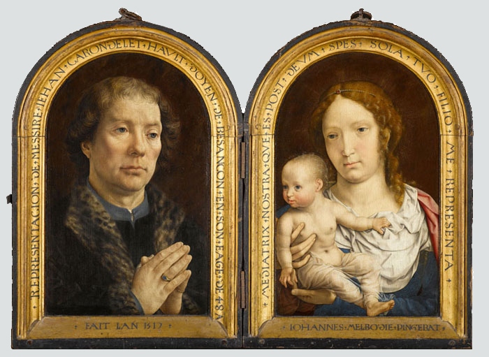
Diptych about Jean Carondelet, 1517, Jan Gossaert
Louvre Museum, Paris, Foto: Wikimedia
Inscription left: REPRESENTACION DE MESSIRE IEHAN CARONDELET HAULT DOYEN DE BESANCON EN AGE DE 48 A
right: MEDIATRIX NOSTRA QUE ES POST DEUM SPES SOLA TUO FILIO ME REPRESENTA IOHANNES MELDOBIE PINGEBAT
Translation left: Darstellung des Herrn Jean Carondelet, Hoher Dekan von Besançon, im Alter von 48 J — Gemacht im Jahr 1517
right: Unsere Vermittlerin, die Du nach Gott die einzige Hoffnung bist, führe mich Deinem Sohn vor Augen — Johannes aus Maubeuge (auf deutsch: Malbode) [=Jan Gossaert] malte es
The typography on the inscribed frames clearly shows these influences. On the one hand, regional differences in font preferences can be found, such as the fine Antiqua fonts on Italian Cassetta frames in contrast to German inscriptions with a preference for Fraktur script. On the other hand, writing styles also prevailed across borders, such as the humanistic Antiqua on Dutch, German, or Italian frames, written mostly in Latin.
There were also regional characteristics in the frame craft itself, such as the types of wood, the method of construction, and not least the development of surface design. For example, while Italian frames were finely carved, gold and polychrome painted, and rich in ornamentation, Dutch Renaissance frames were characterized more by their simplicity and austerity.
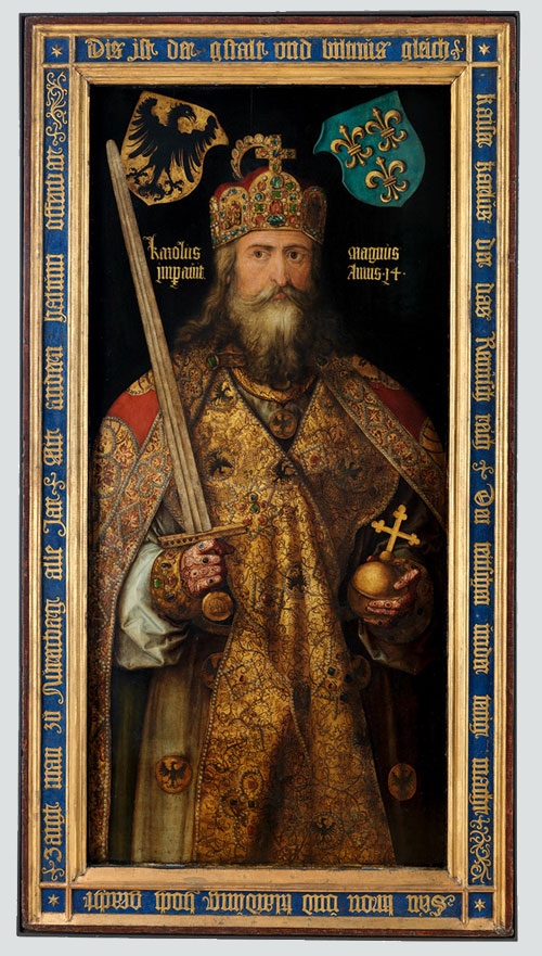
Charlemagne, around 1511/13, Albrecht Dürer
Germanisches Nationalmuseum, Nürnberg, Foto: Germanisches Nationalmuseum
Inscription in old German: Dis ist der gstalt vnd biltnus gleich / kaiser karlus der das Remisch reich. Den teitschen under tenig macht / Sein kron vnd klaidung hoch geacht / zaigt man zu nurenberg alle Jar / Mit andern haltum offenbar
German artists such as Albrecht Dürer also explored script intensively. His portrait of Charlemagne has an inscription on the frame, written in the Fraktur script. Dürer worked with Johann Neudörffer the Elder, a script master from Nuremberg, who was influential in the development of the German Fraktur script at the beginning of the 16th century. The painter Nicolas Neufchâtel, on the other hand, inscribed his portrait of Neudörffer in a classical Antiqua script.
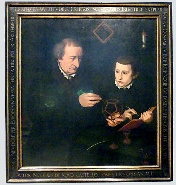
Scriptmaster Johann Neudörffer with a scolar, 1561, Nicolas Neufchâtel
Germanisches Nationalmuseum, Nürnberg, Foto: Kunstbeziehungen
Inscription: IOANES NEVDORFː PER EVROPᾹ VNIVERSᾹ ῙFINITA DISCIPVLO℞ ARITHMETICES / GRAPHICES MVLTITVDINE CELEBRIS INCŌPARABILIS INDVSTRIÆ EXĒPLAR / MAGNŪ ORNAMĒNTŪ PATRːREIPːNORIBːCVI DESIDERATISSːCIVIS EFFIGIĒ V.ÆTAT.LXIII. / AVTOR NICOLAVS DE NOVO CASTELLO.HOSPES.GR.ER.DD.AN.M.D.LXI.
Translation: Johannes Neudörffer, berühmt über ganz Europa durch die unendliche Menge seiner Schüler der Mathematik und Schreibkunst, ein unvergleichliches Beispiel des Fleißes, eine große Zierde seines Vaterlandes, der Republik Nürnberg, welcher das lebensechte Bildnis des höchst begehrten Bürgers im Alter von 63 Jahren der Urheber Nicolaus Neuchâtel, ein Gast, aus Dankbarkeit gewidmet hat im Jahr 1561.
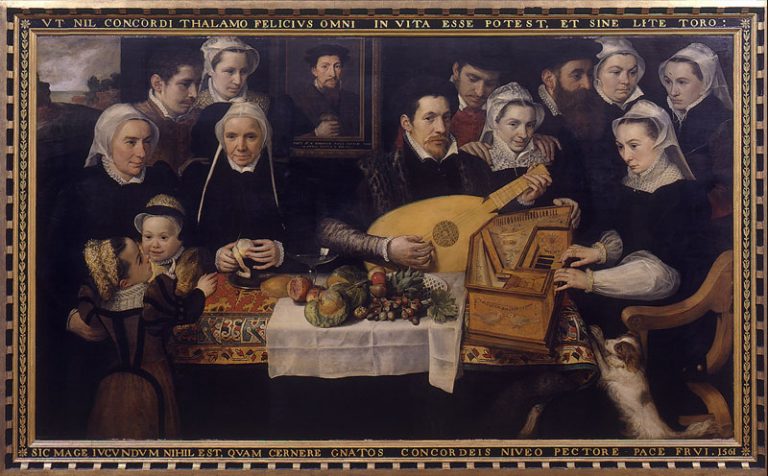
Portrait der Familie van Berchem, 1561, Frans Floris
Stedelijk Museum Wuyts-Van Campen en Baron Caroly, Lier/Belgien, Foto: Wikipedia
Inscription: VT NIL CONCORDI THALAMO FELICIVS OMNI IN VITA ESSE POTEST ET SINE LITE TORO SIC MAGE IVCVNDVM NIHIL EST QVAM CERNERE GNATOS CONCORDEIS NIVEO PECTORE PACE FRVI. 1561
Translation: As in life there can be nothing happier than a marriage in unison and a bed without discord, there is nothing more pleasant than to see one’s offspring in unison enjoy peace with an immaculate mind. 1561
In addition to the church, the picture frame now also found its way into bourgeois homes. House altars, but also self-portraits of wealthy citizens found more and more appeal. Textual content also changed with the emergence of portrait painting in the Renaissance. It is noticeable that the more humanistic the commissioner or artist, the more secular the frame texts turned out to be. Small-format panel paintings, usually constructed as diptychs, featured inscriptions on frames or picture backs about the painted personalities when open or closed. Not only self-confident patrons wanted to immortalize themselves in pictures and texts, but also the artists themselves began to date and sign their pictures on the frames.
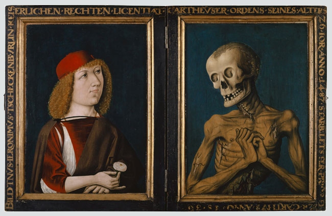
Hieronymus Zscheckenbürlin and the death, Diptych, 1487, Oberrheinischer Meister
Kunstmuseum Basel, Foto: Wikimedia
Inscription: BILDTNVS·IERONIMVS·TSCHECKENBVRLIN·KEIS / ERLICHEN·RECHTEN·LICENTIAT|| CARTHEVSER·ORDENS·SEINES·ALTERS / 26·IOR·ANNO·1487·STARB·LETSTER·PRIOR D / ER·CARTHVS·ANNO·15·36
Translation: Bildnis Hieronymus Tzeckenbürlins, Lizentiats der kaiserlichen Rechte [Des] Karthäuser-Ordens, seines Alters 26 Jahre Anno 1487; Starb [Als] letzter Prior der Karthause Anno 1536
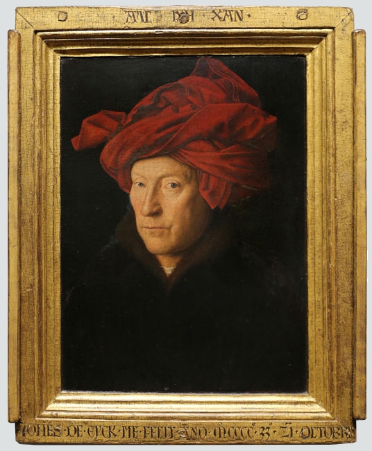
The most prominent and earliest examples are the works of Jan van Eyck. He signed many of his paintings on the lower or upper bar of the frame not only with his name and date, but painted a kind of engraved motto “AS I CAN” on the gilded wood of the frame. This is probably the reason why almost all of his paintings are preserved with the original frame. However, Bartholomew Bruyn the Younger or George Penecz also named themselves as authors on the frames. In contrast to van Eyck’s short inscriptions, Penecz inscribed in two rows around the whole frame. He painted the field captain Sebald Schirmer and textually emphasized on the one hand the achievements of Schirmer and on the other hand the outstanding abilities of the painter, i.e. himself.
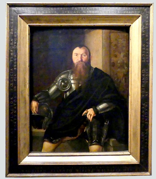
Portrait of the Field Captain Sebald Schirmer from Nuremberg, 1545, Georg Pencz
Germanisches Nationalmuseum, Nürnberg, Foto: Kunstbeziehungen
This original state in which the picture and frame are preserved is extraordinarily rare. Because mostly the frames were changed over the centuries by their owners, dealers or museums. Also with the listed examples to this research it is to be checked whether it is in each case the original frame. This can be answered quickly by looking at the back of the picture and translating the texts. It was not until the late 19th century that museums and private collectors developed an interest in historical authenticity in the framing of their pictures.
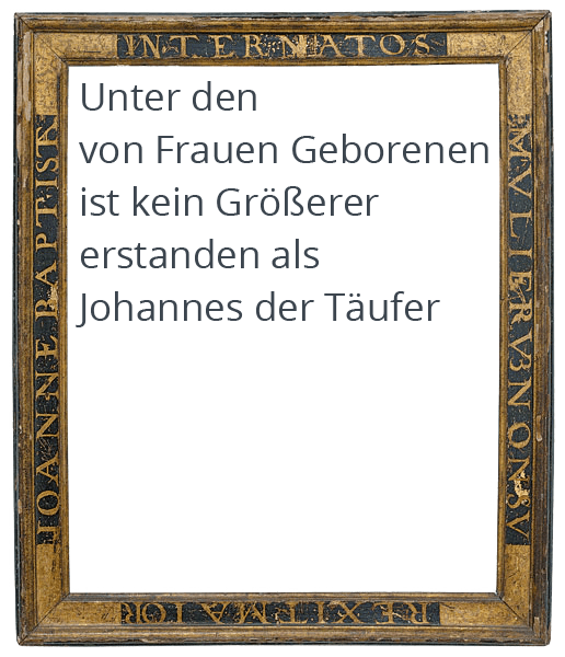
Cassetta frame, Italy, 1520, sgraffito technique, white on black surface
Antike Rahmen Olaf Lemke, Berlin, Foto: Lepkowski Studio
Inscription: INTER NATOS / MVLIERVM NON SV / REXIT MAIORI / JOHANNE BAPTISTA (Matthäus 11, 11)
Translation: Among those who are born of women there has not arisen anyone greater than John the Baptizer.
Today, the inscribed frames stand empty and their texts encourage discussion and “seeing” of imaginary images. They still reveal essential information about the picture. The inscriptions describe the subject of the painting, but also the emotions about it, in a very pictorial way. An indication that the inscriptions belonged to the painting is the closeness of the surrounding texts alone. The words running all around seem to interlock with the motifs. At the latest in our imagination textual and pictorial information mix to one story. However, only if one can also read and understand the texts. The question arises, how text and image came together – provided by the client, chosen by the artist? Who put the inscriptions on the frames? and what difference does the text make in our perception of the artwork in the first place?
Should we strive for the original state, reuniting picture and frame, or are there new ways to see the frames and their inscriptions as art? With imaginary images or even with new modern pictures painted after the texts?
The inscriptions of the frames and their images interest me in particular because they are a testimony to the tradition we still use today in all media: the addition of image and text to reinforce a message and make it accessible to a wider mass.
However, what we create digitally in seconds today was a work process of months, even years, in the Renaissance. Every aspect of production involved specialized knowledge and craft. To shed light on this process and to compare and document it in terms of an European development encompasses a wide range of research fields such as epigraphy, frame craft and restoration, religious studies, art history and art science. Wouldn’t it be interesting to use the Inscribed Picture Frames to reflect on the complex interrelationships of these research fields and developing collaboratively a modern perspective?
Tanja Lemke-Mahdavi
___________________________________________________________
Literature and sources used
Schriftkunst Geschichte, Anatomie und Schönheit der lateinischen Buchstaben, Albert Kapr, Philo-Vlg Verlag der Kunst Amsterdam, 2006
Technique & design in the history of printing, 26 essays by Frans A. Janssen, Brill – Hes & de Graaf, 2004
Privatportraits, Geschichte und Ikonologie einer Gattung im 15. und 16. Jahrhundert, Angelica Dülberg, Gebrüder Mann Verlag Berlin, 1990
Frames, State of the Art, Henrik Bjerre, Statens Museum for Kunst, 2008
Frame Works, Honour and Ornament inItalien Renaissance art, Alison Wright, New Haven : Yale University Press, 2019
Künstlerwerkstätten der Renaissance, Sylvie Beguin, Roberto Cassanelli, Stephen Clancy, Benziger Verlag, 1998
Italien Renaissance Frames, Timothy J. Newbery, George Bisacca, Laurence B. Kanter, The Metropolitan Museum of Art, New York, 1990
Gesichter der Renaissance, Meisterwerke Italienischer Portrait-Kunst, Staatliche Museen zu Berlin, Hirmer Verlag, 2011
Frames and supports in 15th- and 16th-century southern netherlandish painting, Hélène Verougstraete, Royal Institute for Cultural Heritage, Brussels, 2015
The Frame Blog, Lynn Roberts
Deutsche Inschriften Online
Kunstbeziehungen
Digitale Sammlungen: Gemäldegalerie, Berlin; Bode Museum, Berlin; Germanisches Nationalmuseum, Nürnberg, Landesmuseum Bonn; Städel Museum, Frankfurt am Main; Pinakothek, München; Louvre, Paris; National Gallery, London; National Gallery Prague; Central Museum Utrecht, Rijksmuseum, Amsterdam, Groeningemuseum, Brügge; Uffizien, Florenz; Museo del Prado, Madrid; Museo Thyssen-Bornemisza, Madrid
